
Shopify Color and Image Swatches: The Complete Guide to Product Swatches

Learn how Shopify color and image swatches work, which type to use, how to set them up without code, and when a swatch app beats native theme options.
Key Takeaways
- The best Shopify color swatch app fills your theme's gaps: image swatches, collection-page selection, and bulk management without code.
- A Shopify swatch is a clickable color block, image, or button that shows a variant option value instead of a text dropdown.
- Many Online Store 2.0 themes render native color swatches through Shopify's shopify--color-pattern metaobject, but coverage varies by theme.
- Native Shopify swatches usually cannot let shoppers select a variant on collection pages, and products stay capped at three option types.
- Shopify raised the variant limit to 2,048 per product, yet the three-option maximum still blocks catalogs needing a fourth attribute.
- Color swatches suit solid colors; image swatches suit patterns, textures, and materials; buttons suit sizes and text-only options.
- Color Swatch King by StarApps Studio has a free plan, with paid tiers priced by Shopify plan from $5 to $99.90 per month
A shopper lands on your product page, sees a T-shirt they like, and opens the color dropdown: "Sand, Stone, Taupe, Fog, Mist." They have no idea which one is the warm beige in the photo. So they guess, or worse, they leave. Multiply that hesitation across every visitor to every variant-heavy product, and a plain dropdown quietly costs you sales you never see.
Swatches fix that specific moment. Instead of reading five color names, the shopper sees five colors and clicks the one they want. This guide covers everything behind that small change, from the different swatch types to setup, UX, and choosing the right tool for your catalog.
Shopify swatches replace text dropdowns with clickable color blocks, product images, and buttons so that shoppers can see and compare variant options at a glance. This guide covers what swatches are, every swatch type (color, image, size, material, pattern), how to add them with and without code, how to show them on product and collection pages, and how to pick the best Shopify color swatch app when your catalog outgrows native theme support.
It is written for merchants deciding how to present variants, store owners fixing a swatch setup that is not behaving, and teams managing variant-heavy catalogs where selection speed and accuracy shape the buying experience.
What Is a Shopify Product Swatch?
A Shopify product swatch is a clickable visual element that represents a variant option value. When a product comes in several colors, sizes, or materials, a swatch shows each choice as a color block, a small product image, or a labeled button, instead of a line of text inside a dropdown.
The point is faster, clearer variant selection. A shopper choosing between "Sand," "Taupe," and "Stone" cannot tell those shades apart from words alone. A color block or a fabric image removes the guesswork.
Swatches are a display layer. Underneath, the product still has standard Shopify variants and options; the swatch simply translates those option values into something visual. For a deeper primer on the concept itself, see what a color swatch is, or the step-by-step walkthrough of how to show color swatches on Shopify products.
Variant vs. Option vs. Swatch: The Difference Explained
These three terms get used interchangeably, which causes setup mistakes. Here is the distinction:
- An option is the attribute category, such as Color, Size, or Material. A Shopify product allows up to three options.
- An option value is one choice inside an option, such as "Navy" under Color.
- A variant is a specific combination of option values, such as "Navy / Large / Cotton." Each unique combination is one variant.
- A swatch is the visual control a shopper clicks to choose an option value.
You assign a swatch to an option value, and the shopper's selected values resolve to a variant. Keeping the terms straight makes every later configuration step easier.
The Types of Shopify Swatches (Color, Image, Button, Size, Material, Pattern)
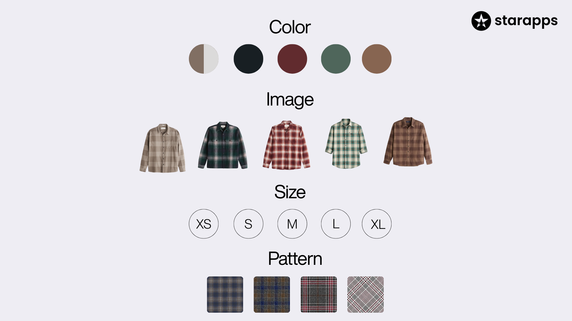
Different attributes call for different swatch styles, and matching the style to the attribute is the single most direct way to make a product page easier to use. The rule underneath all of it: if the difference between two values is visual, show it with a color or image swatch; if it is textual, use a button.
Color Swatches: For Solid, Distinct Colors
A color swatch is a filled block, circle, or square displaying one color, defined by a hex code or a small image. Use it for solid, recognizable colors where the block alone communicates the choice: paint, single-tone apparel, phone cases, and accessories where color is the deciding factor.
Image Swatches: For Patterns, Textures, and Prints
An image swatch shows a small photo instead of a solid block. Use it when variants differ in ways a flat color cannot capture: fabric texture, print, finish, or a multi-color pattern. A "Leopard" or "Herringbone" option is meaningless as a solid block and obvious as a thumbnail. Patterned textiles, wood grains, marble finishes, and floral prints all belong here. This is exactly the job a dedicated image swatch app handles more precisely than most themes.
Button Swatches: For Sizes and Text-Only Options
A button swatch is a labeled rectangle or pill carrying text such as "S," "M," "L," or "42." Buttons work for options that are inherently textual and gain nothing from a picture: clothing sizes, shoe sizes, capacities, and dimensions.
Size, Material, and Pattern Swatches in Practice
These are applications of the three styles above rather than separate technologies:
- Size swatches are almost always buttons, because a size is a label. Lay them out in size order (XS, S, M, L, XL), not alphabetically.
- Material swatches are image swatches when the material has a distinct look (leather vs. canvas, oak vs. walnut) and buttons when it does not (cotton vs. linen).
- Pattern swatches are image swatches by nature, because a pattern has to be seen to mean anything.
For attribute-specific setup, the size-swatch tool guide covers button styling and size confirmation in more detail.
Why Swatches Improve Product Discovery and Variant Selection
Swatches make variant selection faster and clearer in four concrete ways:
- They shorten the decision. Every color is visible and comparable at once, so shoppers do not open a dropdown, read labels, and translate names into shades in their heads.
- They cut selection mistakes. When option values are visible and the active choice is obvious, shoppers are less likely to add the wrong variant, which matters most in apparel where color and size are easy to confuse.
- They work better on mobile. Tapping a visible swatch is faster and more forgiving than operating a native dropdown on a small screen.
- They surface variety earlier. Collection-page swatches let a shopper see that a product comes in eight colors before opening the product page, which can influence whether they click at all.
One honest caveat on claims: swatches are a usability and presentation improvement. Any effect on conversion rate, return rate, or revenue depends on your catalog, traffic, and theme, and varies between stores. Treat swatches as a way to make selection clearer, not as a guaranteed lift.
When to Use Color Swatches vs. Image Swatches
Use color swatches for solid colors and image swatches for anything with visual detail a flat block cannot show. This table covers the common cases:
When in doubt, ask whether a shopper could pick correctly from the swatch alone without reading a label. If yes, a color block is enough. If they would need to see the actual product, use an image.
Swatches on Product Pages: Setup and Best Practices
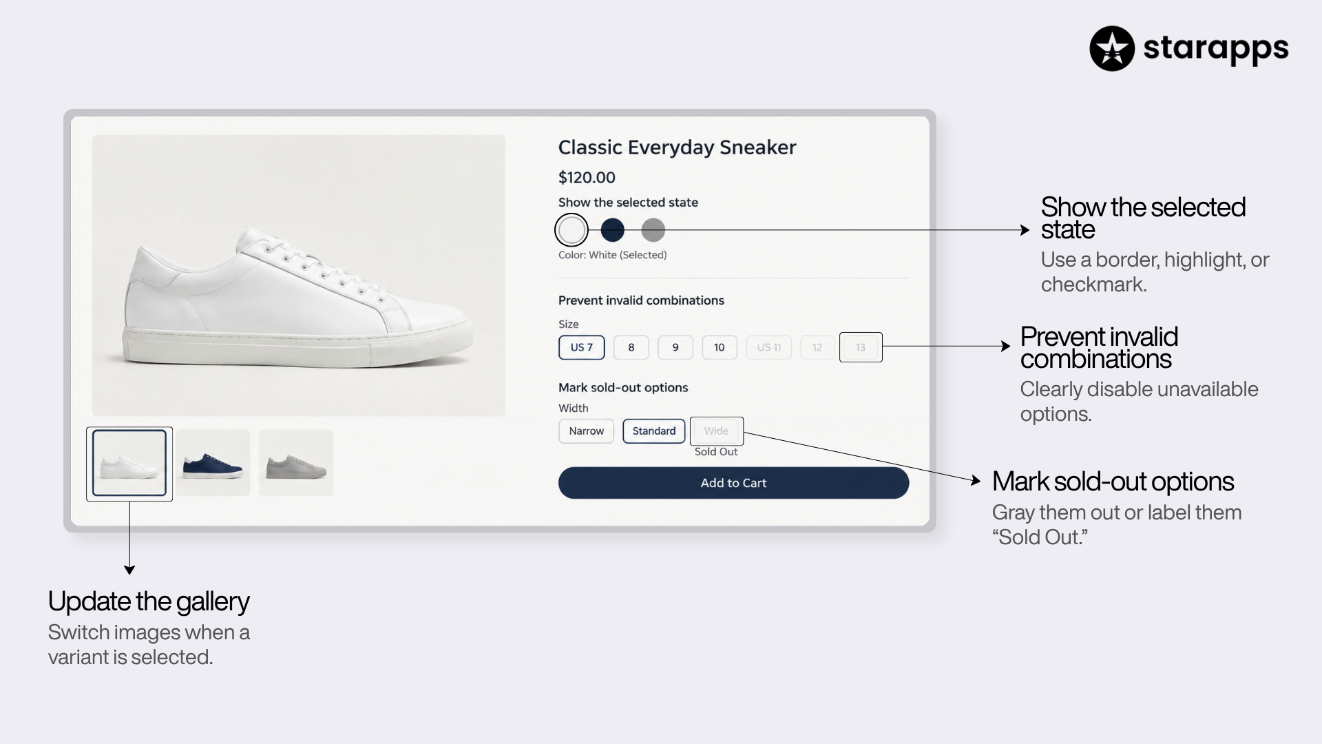
On the product page, swatches present every option value for a single product and let the shopper build a variant. Four things separate a clean setup from a frustrating one:
- Show the selected state clearly: The active swatch should stand out with a border, highlight, or checkmark, so shoppers always know what they picked, especially when tones are close.
- Reflect the selection in the gallery: When a shopper picks "Green," the main image should switch to the green variant. Shopify handles this through variant images in the theme, or through a tool that links images to variants.
- Handle unavailable combinations: If "Green" exists only in "Large," the interface should make that clear rather than allow an impossible combination.
- Choose how to treat out-of-stock values: Hiding, graying out, or marking values "sold out" are all options. Graying out usually beats hiding, because it tells the shopper the option exists and may return. For the specifics, see how to handle sold-out swatches on Shopify.
Swatches on Collection and Category Pages
Collection-page swatches show variant options directly in the product grid, so shoppers see available colors or sizes before clicking into a product. This is the clearest dividing line between native theme behavior and a dedicated color swatch collection page app.
Many themes can display a swatch preview on collection cards. Far fewer let a shopper actually select a variant on the collection page and land on the correct variant after clicking through. That selection behavior is usually where native support stops and an app takes over.
Collection-page selection helps most for:
- Fashion and apparel, where color is a primary browsing filter.
- Large catalogs where one style comes in many colorways.
- Stores where shoppers browse by look first and specifics second.
If collection-page selection matters to you, confirm what your theme actually does before assuming it works, because behavior differs widely. Our guide to adding a variant selector to Shopify collection pages walks through the setup, and the collection-page settings documentation covers the in-app configuration.
How to Add Color Swatches Without Code
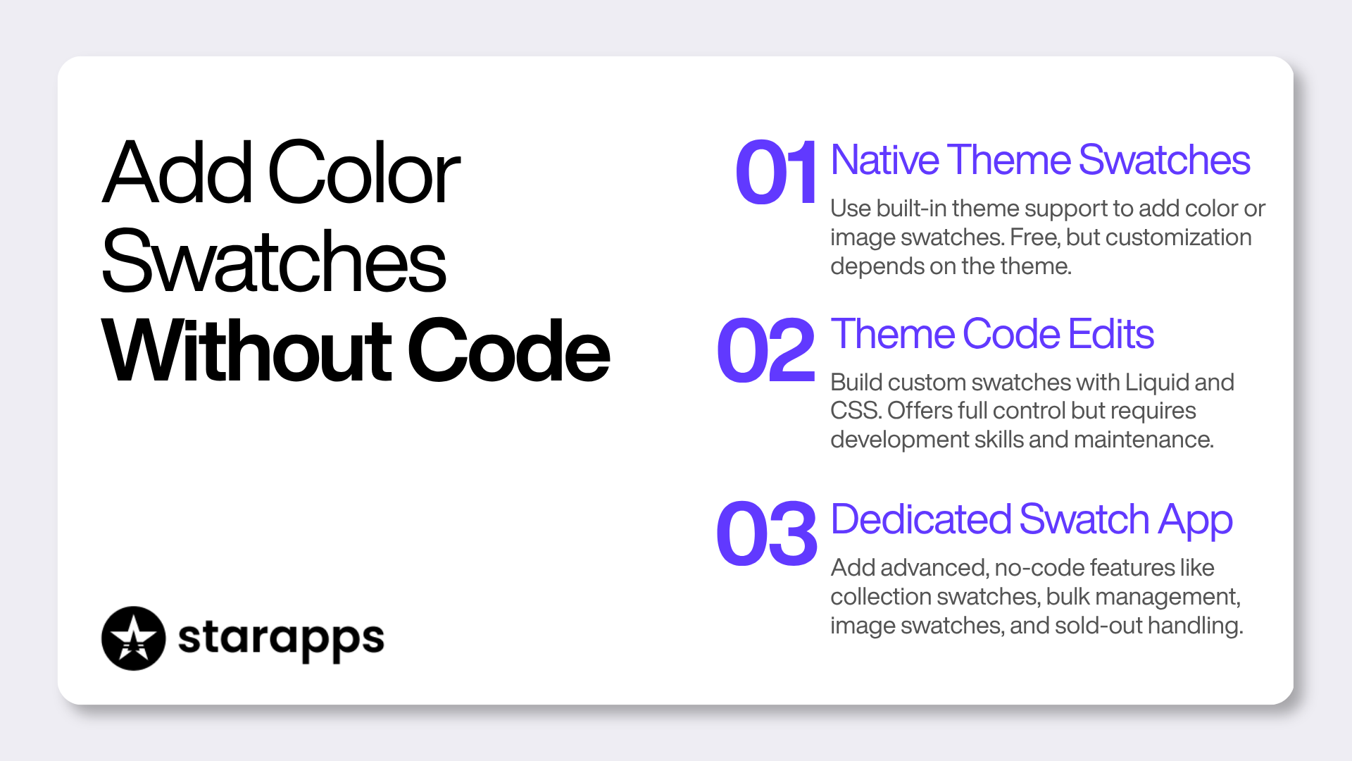
You can add swatches to a Shopify store three ways, in rising order of control: native theme settings, theme code edits, or a swatch app. Two of the three need no code at all.
Method 1: Native Theme Swatches
Many Online Store 2.0 themes read your variant option values and render swatches automatically through Shopify's built-in color system. Under the hood, Shopify uses a managed metaobject called shopify--color-pattern, connected to products through category metafields.
To set it up:
- Confirm your theme advertises variant or color swatch support.
- In the theme editor, open the product or variant settings and enable swatches.
- For each option value, assign a Shopify standard color or create a custom one with a hex code, an optional image, and a label.
- Save. The variant picker should render swatches on the storefront immediately.
This costs nothing beyond your theme, but it is theme-dependent and limited in how far you can customize behavior, particularly on collection pages. Setup differs by theme, so a theme-specific walkthrough like adding color swatches on the Dawn theme is often the fastest way to get the exact steps for your store.
Method 2: Theme Code Edits
If your theme lacks swatch support or you need behavior it does not offer, you can build swatches in Liquid and CSS. This gives full control but requires development skill, ties the work to your specific theme, and breaks or needs rechecking on every theme update. For most merchants, it is the least practical route.
Method 3: A Dedicated Swatch App
A color swatch app without code adds a configuration dashboard on top of your store, so you set swatches through an interface instead of editing files. Apps typically cover the gaps native swatches leave: collection-page selection, bulk management, image swatches with fine control, out-of-stock handling, and grouping separate products as one set of variants. For merchants who want no-code swatches plus capabilities a theme does not offer, an app is the intended path.
How to Set Up Swatches With Color Swatch King (Step by Step)
The setup flow is similar across quality swatch apps. Using Color Swatch King as the reference:
- Install the app from the Shopify App Store and grant the required permissions.
- Enable the app on your theme through the app embed in the theme editor.
- Open the dashboard and go to the Shopify Variants section, which lists your product options.
- Choose a display style per option. Pick a color swatch, image swatch, button, or slider for each option (color swatch for Color, buttons for Size).
- Set the swatch image source. Decide whether each swatch pulls from a hex color, an uploaded image, or an automatically matched variant image.
- Turn on collection-page display where you want shoppers to see or select options in the grid.
- Configure out-of-stock behavior and, if needed, prevent default variant selection so shoppers must choose explicitly.
- Bulk upload via CSV for large catalogs, instead of setting each swatch by hand.
The advantage of the app route is that these settings live in a dashboard and survive theme updates, rather than sitting in theme code you have to maintain.
Common Swatch Problems and How to Fix Them
Most swatch issues trace back to a handful of causes. Here is how to diagnose and fix the frequent ones:
- Swatches do not appear after install: The app embed is likely off, or no display style is assigned to the option. Check the app embed toggle in the theme editor and confirm a style is applied.
- Swatches overlap titles or break the layout: This is usually a CSS spacing conflict with the theme. Most apps offer styling controls, and support teams routinely make small theme-specific adjustments.
- A default variant is preselected, and shoppers order the wrong one: Enable manual or "confirm selection" behavior, so no variant is chosen until the shopper picks. This is the direct fix for accidental default-variant orders.
- Selecting a color does not change the main image: The product images are not linked to variants. Link variant images in the theme, or use an image-to-variant tool so the gallery follows the swatch.
- Collection-page swatches show colors, but clicking lands on the wrong variant: A limitation of some native setups. Apps with true collection-page selection carry the chosen variant through to the product page.
- You have run out of option slots: Shopify caps products at three option types. If you need a fourth (Color, Size, Material, Length), native variants cannot do it, and grouping separate products is the usual workaround.
Switching From Another Swatch App
If you already run a swatch app and want to move, the main concern is not losing your existing swatch data. Most established apps offer a migration or import path, so you do not have to rebuild every color and image by hand.
Before you switch:
- Check for an import tool. Confirm the new app can pull swatches, image mappings, and any product groups from your current one, ideally via CSV or a built-in migration.
- Test on a few products first. Install on the free plan, migrate a handful of variant-heavy products, and confirm the storefront renders correctly before rolling out store-wide.
- Uninstall cleanly. Remove the old app's embed and any leftover theme code so two swatch systems are not fighting over the same product options.
When a migration goes sideways, the deciding factor is usually support responsiveness rather than the migration button itself, so weigh setup help as part of the switch.
Swatch UX and Accessibility Best Practices
Good swatch design comes down to clarity and not making shoppers think:
- Make the selected state obvious: A visible border, fill, or checkmark on the active swatch prevents confusion when colors are close in tone.
- Do not rely on color alone: Some shoppers cannot distinguish certain colors, so pair swatches with accessible labels or names. This also aligns with the Web Content Accessibility Guidelines, which advise against using color as the only way to convey information.
- Keep tap targets large enough: Small, tightly packed swatches cause mis-taps on mobile; give each one room.
- Order values logically: Sizes run in size order, not alphabetically. Group colors sensibly rather than at random.
- Communicate availability honestly: Mark out-of-stock values clearly instead of silently removing them.
- Limit visible swatches when there are many: For dozens of colors, a slider or a "show more" control keeps the page manageable without hiding options.
Mobile Swatch Experience
Most Shopify traffic is mobile, so the mobile layout deserves specific attention. Swatches beat dropdowns on phones because tapping a visible option is faster and less error-prone than operating a native select menu.
Mobile also punishes bad spacing. Prioritize adequate tap size, selected states that stay legible on a small screen, and a layout that wraps cleanly instead of forcing horizontal scroll. For options with many values, a slider usually works better on mobile than a long wrapping grid.
Managing Swatches for Large and Variant-Heavy Catalogs
Past a certain size, the question shifts from how swatches look to how you manage them at scale. Four factors matter:
- Bulk setup. Configuring swatches one product at a time is impractical past a few dozen products. CSV upload defines swatches and groups for hundreds or thousands of products at once, which is the main reason large stores lean on apps.
- Variant limits. Shopify raised the per-product ceiling to 2,048 variants, removing a long-standing constraint, though the practical implications of the Shopify variant limit run deeper than the raw number. The three-option-type maximum has not changed, so a product needing Color, Size, Material, and a fourth attribute still cannot express that natively.
- Grouping separate products. When a style needs more option types than Shopify allows, or when you want each colorway to keep its own URL for SEO and merchandising, some apps link separate products and present them as one set of variants. This sidesteps the option-count limit and preserves distinct variant URLs.
- Performance and consistency. Large variant counts can slow admin work, and Shopify applies its own throughput limits at high volumes. Set a default swatch style so new products inherit consistent presentation automatically.
Swatches, Variant URLs, and SEO
Swatches themselves are a front-end display, so simply switching a dropdown to color blocks does not change how Shopify indexes a product. The SEO question comes up in a specific case: when one style spans more colors or option types than a single Shopify product can hold, and you split it across several products.
By default, splitting a "Merino Crew" sweater into eight color-specific products can create thin, near-duplicate pages competing with each other. The workaround used by Shopify combined listings and similar tools is to link those separate products and present them as one set of variants on the storefront, while keeping a distinct, indexable URL for each colorway. That gives each color its own landing page for search and paid traffic, its own entry in a Google or Meta product feed, and cleaner analytics, without showing shoppers eight fragmented listings.
Two practical notes:
- Canonicalization still matters. However you split or combine products, make sure each variant URL is either genuinely distinct or correctly canonicalized, so you are not diluting ranking signals across duplicates. Shopify's own guidance on duplicate content and canonical URLs is the reference point here.
- Collection-page selection helps internal linking. When a collection-page swatch links through to the exact variant URL a shopper clicked, you get clean internal links to each variant page rather than every swatch pointing at one generic product URL.
If unique variant URLs are part of your SEO plan, it is worth getting the variant SEO and URL structure right up front, and confirming the app you choose preserves those URLs rather than collapsing everything into fragment parameters.
Native Shopify Swatches vs. a Swatch App: Which to Choose
Both can be right; the answer depends on your catalog and your theme. This comparison lays out where each fits:
Native swatches fit a modern theme with solid swatch support, a straightforward catalog, and no need for collection-page selection or bulk tools. An app fits when you need controlled image swatches, collection-page selection, bulk management, out-of-stock rules, or a way around the three-option limit.
How to Choose the Best Shopify Color Swatch App
The best Shopify color swatch app is the one that covers the specific gaps your theme leaves. Weigh these criteria against your store's needs, and for a ranked shortlist, see the best Shopify color swatch apps for 2026:
- Swatch types: Color, image, and button swatches, plus a slider for options with many values.
- Collection-page support: Real variant selection on collection pages that lands shoppers on the right variant.
- Bulk tools: CSV upload and export for large catalogs.
- Out-of-stock control: Hide, gray out, or mark unavailable options.
- Default-selection control: Require an explicit choice to prevent wrong-variant orders.
- Theme compatibility: Works with your theme and survives theme updates.
- Ecosystem fit: Plays well with Shopify Markets, B2B, filters and search, size charts, and recommendations if you use them.
- Migration: Imports swatches from an app you already run.
- Support: Setup help is available, since swatch styling often needs small theme-specific adjustments.
- Pricing that scales: Cost tracks your Shopify plan and catalog size sensibly.
For a full ranked comparison, see the roundup of the best Shopify color swatch apps for 2026.
Where Color Swatch King Fits
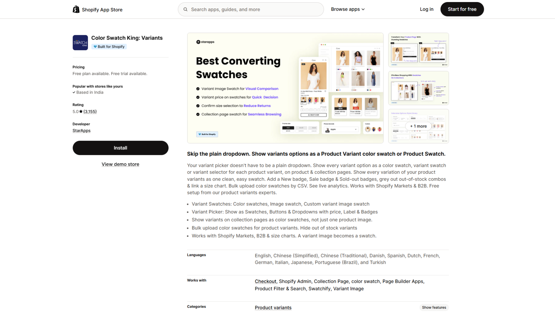
Color Swatch King: Variants, built by StarApps Studio, is one of the most-reviewed apps in Shopify's product variants category, holding a 4.9 rating across more than 3,150 reviews since its July 2019 launch. It carries Shopify's Built for Shopify badge and fits stores that have outgrown native theme swatches and want visual variant selection controlled from a dashboard rather than through theme code. It is part of a wider suite of StarApps variant tools, so pairing it with a variant-image app to sync the gallery to the selected swatch is straightforward.
Verified Features
Based on the app's official App Store listing and StarApps documentation, Color Swatch King supports:
- Color, image, and button swatches, plus dropdowns and a slider, chosen per option from a style library.
- Collection-page swatches, so shoppers can see and select options in the product grid and land on the correct variant.
- Automated variant image swatches (SupaEasy), which pull the relevant variant image instead of building each swatch by hand.
- Badges and low-stock alerts, including New, Sale, and Sold-out badges, plus the option to grey out out-of-stock combinations.
- Bulk upload via CSV for color swatches and product groups.
- Confirm size selection / prevent default selection to reduce wrong-variant orders.
- Size chart linking on the variant picker.
- Grouping separate products as one set of variants through the StarApps variant system, which keeps individual variant URLs and works around the three-option limit.
- Live analytics on swatch performance.
- Migration from an existing swatch app.
- Compatibility with Shopify Markets, B2B, product filters and search, size charts, product recommendations, and multi-language translation apps.
- Free setup support from the StarApps team, useful because swatch styling often needs theme-specific tweaks. You can reach the StarApps team to have swatches configured for your theme.
For a feature-by-feature walkthrough, see the Swatch King variant options guide.
Color Swatch King Pricing
Color Swatch King has a free plan, plus a paid "Pay As You Grow" plan priced by your Shopify plan, per the current App Store listing:
A 30-day free trial is available, and all charges are billed in USD. Pricing and plans can change, so confirm current terms on the Swatch King App Store listing before installing.
Conclusion: Turn Variant Confusion Into Clear Choices
Swatches solve a small but costly moment: the shopper who cannot tell "Sand" from "Stone" and hesitates. Get them right, and variant selection becomes something people do without thinking, on product pages, on collection pages, and on mobile where most of your traffic already is.
The decision itself is straightforward. Match the swatch style to the attribute (color blocks for solid colors, images for patterns and materials, buttons for sizes). Check what your theme handles natively. Reach for an app when you need image swatches with real control, collection-page selection, bulk management, out-of-stock rules, or a way around Shopify's three-option limit.
If native swatches cover your catalog, use them and move on. If they leave gaps, the practical way to find out is to test rather than guess. Install Color Swatch King on its free plan, set up swatches on one variant-heavy product, and see how it renders on your live theme before rolling it out store-wide. Setup help is free if you get stuck, so you can have the StarApps team configure swatches for your theme rather than wrestling with CSS yourself.
Start with one product today. A clearer variant picker is one of the few changes you can ship this afternoon and see on the storefront the same day.
Frequently Asked Questions
Does Shopify support color swatches by default?
Partly. Many Online Store 2.0 themes render color swatches natively through Shopify's shopify--color-pattern metaobject and category metafields. Coverage depends on the theme, and native support is limited for collection-page variant selection and image-based swatches, which is where an app or theme code comes in.
What is the difference between a color swatch and an image swatch?
A color swatch is a solid block defined by a hex code or small image, best for distinct solid colors. An image swatch shows a thumbnail photo, best for patterns, textures, prints, and materials where a flat color cannot convey the difference.
Can I add Shopify swatches without editing code?
Yes. Use your theme's native swatch settings if it supports them, or install a swatch app and configure everything from a dashboard. Editing theme code is a third option that gives full control but requires development skill and ongoing maintenance.
What is the best Shopify color swatch app?
The best app is the one that fills your theme's specific gaps. Color Swatch King by StarApps Studio is among the most-reviewed options at a 4.9 rating and covers color and image swatches, collection-page selection, bulk upload, and out-of-stock handling. Your choice depends on catalog size, whether you need collection-page selection, and how many option types you require.
Can I show swatches on Shopify collection pages?
Some themes show a swatch preview on collection cards, but letting shoppers select a variant on the collection page and land on the right variant usually requires an app. Confirm your theme's exact behavior, and use a collection-page swatch app if native handling falls short.
How many variants and options can a Shopify product have?
Shopify allows up to 2,048 variants per product, raised from the earlier limit of 100. Products are still capped at three option types. If you need a fourth option type, native variants cannot do it, and grouping separate products through an app is the common workaround.
How much does Color Swatch King cost?
Color Swatch King has a free plan and a paid "Pay As You Grow" plan priced by Shopify plan, from $5 per month (Pause & Build) to $99.90 per month (Shopify Plus), with a 30-day free trial. Confirm current pricing on the App Store listing, since plans can change.
How do I stop customers from ordering the wrong size?
Enable a setting that prevents default variant selection, so shoppers must make an explicit choice before adding to cart. Color Swatch King and similar apps offer a "confirm size selection" feature built for this.
Will a swatch app slow down my Shopify store?
Well-built swatch apps run inside Shopify themes without significant performance cost, though very large variant counts can affect admin and storefront speed regardless of the app used. Test on your own theme and catalog, and use bulk tools and sensible defaults to keep large catalogs manageable.
Heading

End-to-end traceability
To ensure regulatory compliance, you must have a complete overview of your products from production to shipping. Book a demo to see how Katana can give you full visibility of your operations.
.png)

.svg)

.svg)

.svg)
.png)