
The Mobile-Friendly Shopify Swatch App Guide: Tap Size, Layout and Speed


A guide to choosing a mobile-friendly Shopify swatch app, judged on tap size, spacing, layout, and variant clarity, comparing Color Swatch King, Globo, GLO, OPTIS, and NS with a checklist for testing on your own store.
Key Takeaways
- A mobile-friendly Shopify swatch app is judged on tap size, spacing, layout, and variant clarity on a small screen, not the length of its feature list.
- WCAG 2.2 sets a tap-target floor of 24x24 CSS pixels; Apple advises 44pt and Google 48dp for comfortable finger interaction.
- Swatches that look clean on desktop can wrap awkwardly, crowd together, or force horizontal scrolling once the screen shrinks to phone width.
- Color Swatch King by StarApps holds the Built for Shopify badge and adds color and image swatches on product and collection pages, with adjustable sizing.
- Globo Product Options suits stores needing custom options too; GLO Color Swatch, OPTIS, and NS Color Swatch are swatch-focused alternatives at different prices.
- A swatch app's page-speed impact depends on its implementation and your other apps, so measure it on your own store rather than trusting generic claims.
- Always test on a real phone with a high-variant product, checking tap accuracy, selected state, and wrapping before you commit to an app.
A merchant installs a swatch app, opens the product page on a laptop, sees a tidy row of color circles, and ships it. The problem surfaces later in the analytics: mobile conversion on variant-heavy products stays flat, and nobody can say why.
The reason is structural. A swatch layout with 1200 pixels of horizontal room on desktop gets compressed into roughly 360 to 400 pixels on a phone. Options that sat in one comfortable row now wrap, sometimes mid-label. Circles that were easy to click with a mouse become fiddly for a thumb. Long variant names like "Brushed Antique Brass" break the grid. Unavailable options that were obvious on desktop lose their distinction on a cramped screen. Because most Shopify storefront traffic is mobile, the version of the swatch experience that matters most is the one merchants inspect least.
This is why mobile swatch usability deserves its own evaluation rather than being folded into a generic feature comparison. The rest of this guide treats mobile as the primary lens: how swatches tap, space, wrap, scroll, and load on a phone, and how to judge any Shopify swatch app against those criteria, including apps not covered here.
What Makes A Shopify Swatch App Mobile-Friendly?
A mobile-friendly Shopify swatch app renders variant options that are easy to tap, clearly separated, visually distinct, and responsive enough to avoid accidental selections or awkward scrolling. These criteria separate a swatch implementation that helps shoppers from one that quietly costs sales.
Tap size: Can a shopper select a variant with a thumb on the first attempt? Targets that are too small force zooming or repeated taps at the moment someone is deciding to buy. The WCAG 2.2 Target Size (Minimum) criterion sets a floor of 24x24 CSS pixels at Level AA, while the older Target Size (Enhanced) criterion asks for 44x44 at Level AAA. Apple's Human Interface Guidelines recommend 44pt, and Google's Material Design recommends 48dp for comfortable tapping. The practical reconciliation: 24px is the floor you must not go under, and 44 to 48px is the size you should build.
Spacing: Even correctly sized swatches fail if they sit too close together, because adjacent targets invite accidental taps. WCAG allows smaller targets when they carry sufficient spacing, so spacing is part of the accessibility calculation, not a nicety.
Responsive layout: Swatches must reflow cleanly as the viewport narrows, not stay locked to a desktop grid that overflows the screen.
Wrapping: When a product has many variants, how the swatches wrap onto multiple rows decides whether the page stays scannable or becomes a cluttered block.
Scrolling: A swatch row that forces horizontal scrolling is a common, avoidable mobile failure. Vertical scrolling is expected on phones; sideways scrolling to see color options is not, and shoppers routinely miss options they cannot see.
Labels: Color, size, and material names have to stay legible. Truncated or overlapping labels create doubt about what is being selected.
Visual clarity: Shoppers should distinguish options at a glance. Similar colors, tiny image swatches, or low contrast slow the decision.
Selected-state visibility: The current selection must be unmistakable. A faint border that reads fine on desktop can vanish on a phone in daylight.
Image swatches: Where variant images act as swatches, they need to stay large enough to interpret and tap without becoming a memory test.
Loading and performance: The implementation should not add unnecessary page weight, blocking scripts, or extra requests, especially on mobile connections.
Theme compatibility: The layout has to stay usable across common Shopify themes and screen sizes, not just the one theme the merchant happened to test.
Each criterion maps to a real moment in the mobile purchase flow. Miss one and you add friction exactly where shoppers decide whether to add to cart.
How We Evaluated Each Shopify Swatch App For Mobile
A note on method, because honesty about testing matters.
This guide is built on verified product information from official Shopify App Store listings and developer documentation, combined with observed interface behavior from app store demos and screenshots, and interpretation grounded in published accessibility and UX standards. Where a claim is a documented app capability, it is presented as such. Where it is a judgment about mobile suitability, it is framed as judgment.
This guide does not invent measurements. No Lighthouse scores, Core Web Vitals figures, load times, or tap dimensions are presented as measured results, because a controlled test across live stores with identical conditions was not the basis for this comparison. If you need those numbers for your store, the testing section below explains how to generate them yourself, which is the only way to get performance data that reflects your theme, catalog, and app stack.
The evaluation framework:
No numerical scores are assigned, because assigning them without controlled measurement would be the exact fabrication this guide avoids.
Shopify Swatch Apps Compared At A Glance
The Best Mobile-Friendly Shopify Swatch Apps Compared
The apps below are widely used, currently maintained, and directly relevant to variant swatch display. Options-builder apps are included where they also handle swatches, with a note on where their focus differs. Ratings and pricing change often, so confirm current figures on each listing before deciding.
Color Swatch King: Variants (Starapps)
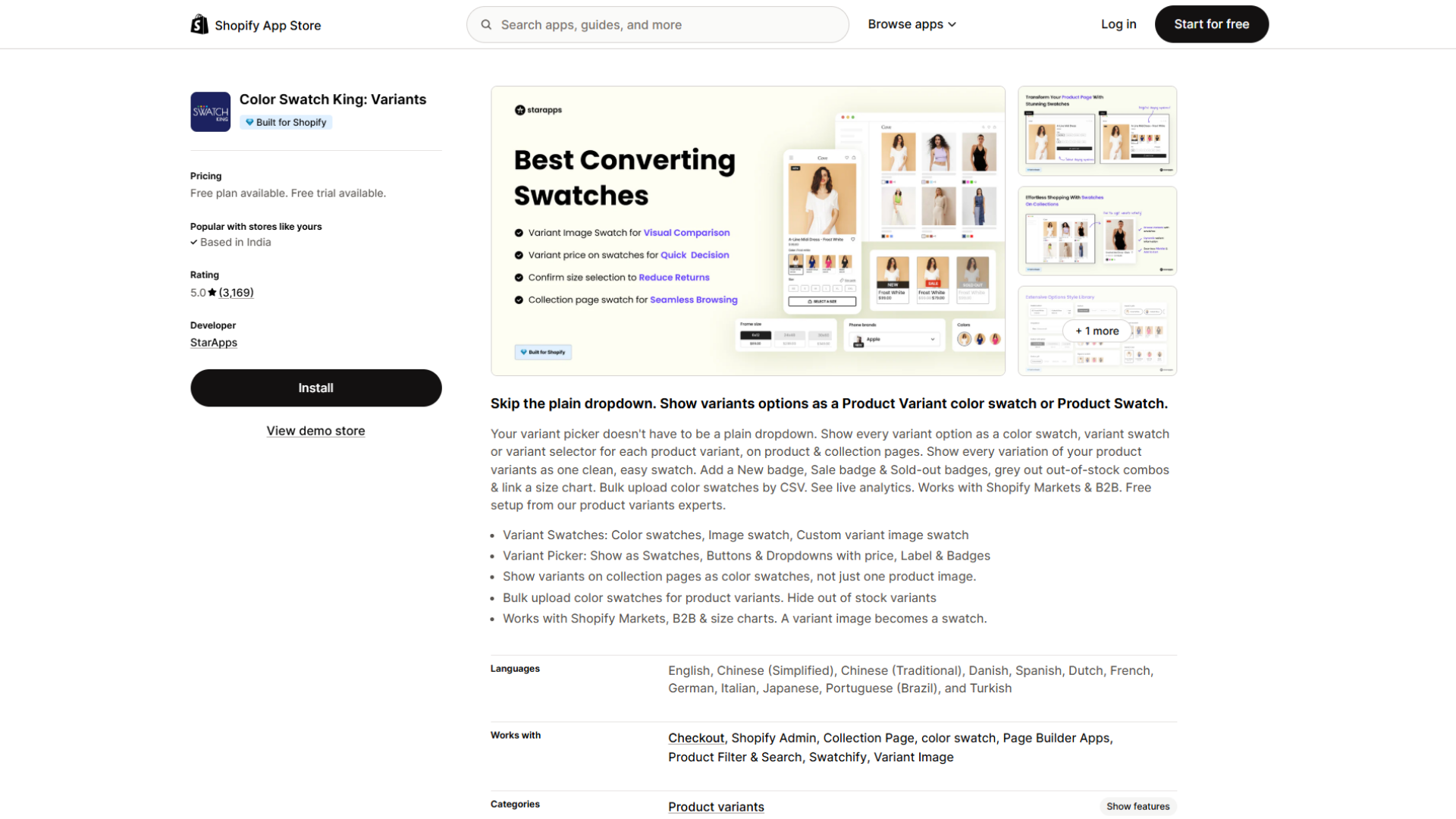
Color Swatch King replaces default Shopify option selectors with color swatches, image swatches, and button-style pickers on both product and collection pages. It carries the Built for Shopify badge, which Shopify awards for meeting its highest standards on performance, design, and integration. The listing shows a 5.0 rating across roughly 3,168 reviews, and the app has been live since 2019, one of the longer track records in the category.
Mobile swatch experience: The app renders options as tappable swatches rather than a dropdown, generally the better mobile pattern because it removes a tap and keeps options visible. It supports color swatches, custom image swatches, and variant-image swatches, and shows swatches on collection pages, letting shoppers switch color options before opening the product and reducing back-and-forth on a phone.
Tap and spacing: Swatch size, shape, and spacing are adjustable rather than fixed, so you can set dimensions and gaps at or above the comfortable 44px target instead of accepting a cramped default. Responsibility still sits with the merchant to configure sensible sizing.
Layout and responsiveness: The app is theme-tailored and supports custom CSS, so the grid can be tuned to reflow cleanly at phone widths. The listing also notes support for different desktop and mobile swatches in its higher tier, which speaks directly to the desktop-mobile gap.
Variant types: Color, custom image, variant-image, button, and dropdown, with the option to add price, labels, and status badges.
Performance: The Built for Shopify badge signals the app has met Shopify's performance bar, a meaningful third-party signal though not a substitute for testing on your store. No specific speed measurements are claimed.
Pricing: Free plan for Shopify Partner, Staff, and Trial stores. Paid pricing scales with your Shopify plan: from $5/month on Pause & Build, $14.90 on Basic, $29.90 on Grow and Custom, $49.90 on Advanced, and $99.90 on Plus. A 30-day free trial is offered.
Best for: Merchants who want dedicated, customizable variant swatches on product and collection pages, especially where matching swatch sizing to mobile matters and where hiding or greying out unavailable variants is important.
Limitations: Pricing scales up on higher Shopify plans, so a Plus store pays well above the headline $5. As with any customizable app, good mobile results depend on configuring size and spacing thoughtfully rather than shipping defaults.
Verdict: A capable, well-reviewed, Shopify-endorsed swatch app whose customization and collection-page support make it a strong fit for mobile-focused variant display, provided the merchant tunes the sizing.
Globo Product Options, Variant (Globo.Io)
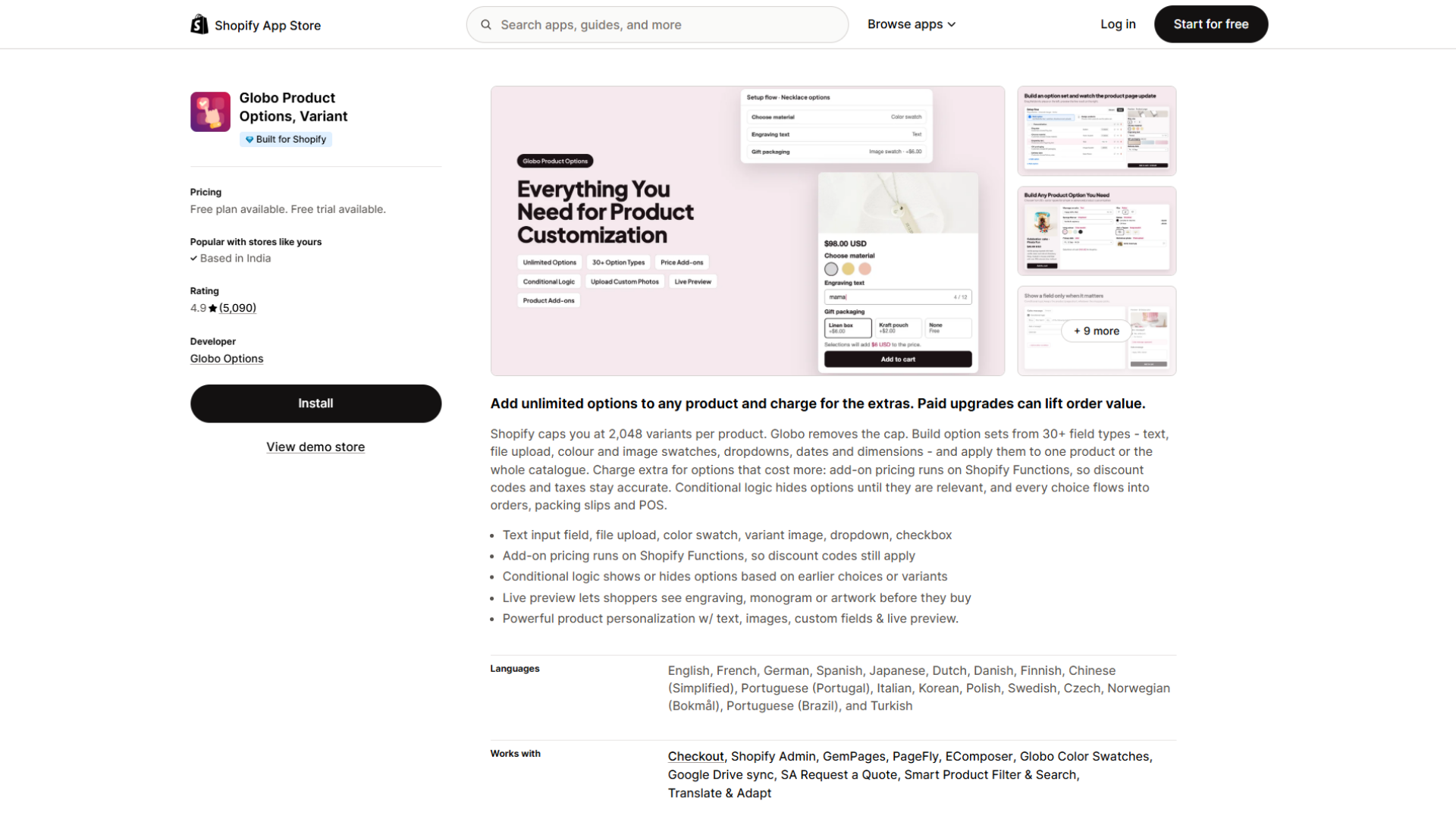
Globo Product Options is the most-reviewed app in the broader product-options category, with a 4.9 rating across roughly 4,700 reviews and a Built for Shopify badge. It is an options builder first: 15 to 20-plus option types including color and image swatches, conditional logic, add-on pricing, and cart-page editing.
Mobile swatch experience: Globo renders color and image swatches and is described as fully mobile-responsive with POS support. Because it handles complex custom options, swatch display is one part of a much larger toolset rather than the sole focus.
Tap and spacing: Swatch styling is adjustable to fit the theme on paid tiers. Mobile tap comfort depends on styling and on how many option groups appear on one screen.
Layout and responsiveness: Responsive by design, but a product with many stacked option types can become long on mobile, so layout planning matters more here than with a swatch-only app.
Variant types: Color swatch, image swatch, buttons, dropdowns, radio, plus text, file upload, and many non-swatch types.
Performance: Built for Shopify badge is present. No specific measurements claimed.
Pricing: Free plan (genuinely useful, not a trial): 15 option types, unlimited option sets, products, and orders. Premium $9.90/month( $39.90 on Plus ), Advanced $19.90/month($59.90 on Plus).
Best for: Stores that need real custom options (personalization, add-ons, conditional logic) alongside swatches.
Limitations: Its breadth is overkill if all you need is color and image swatches, and Plus pricing is substantially higher than the base tiers.
Verdict: The strongest choice when swatches are one requirement among many custom-option needs. For pure swatch display, a swatch-focused app is more direct.
Glo Color Swatch Variant Image (Globo Options)
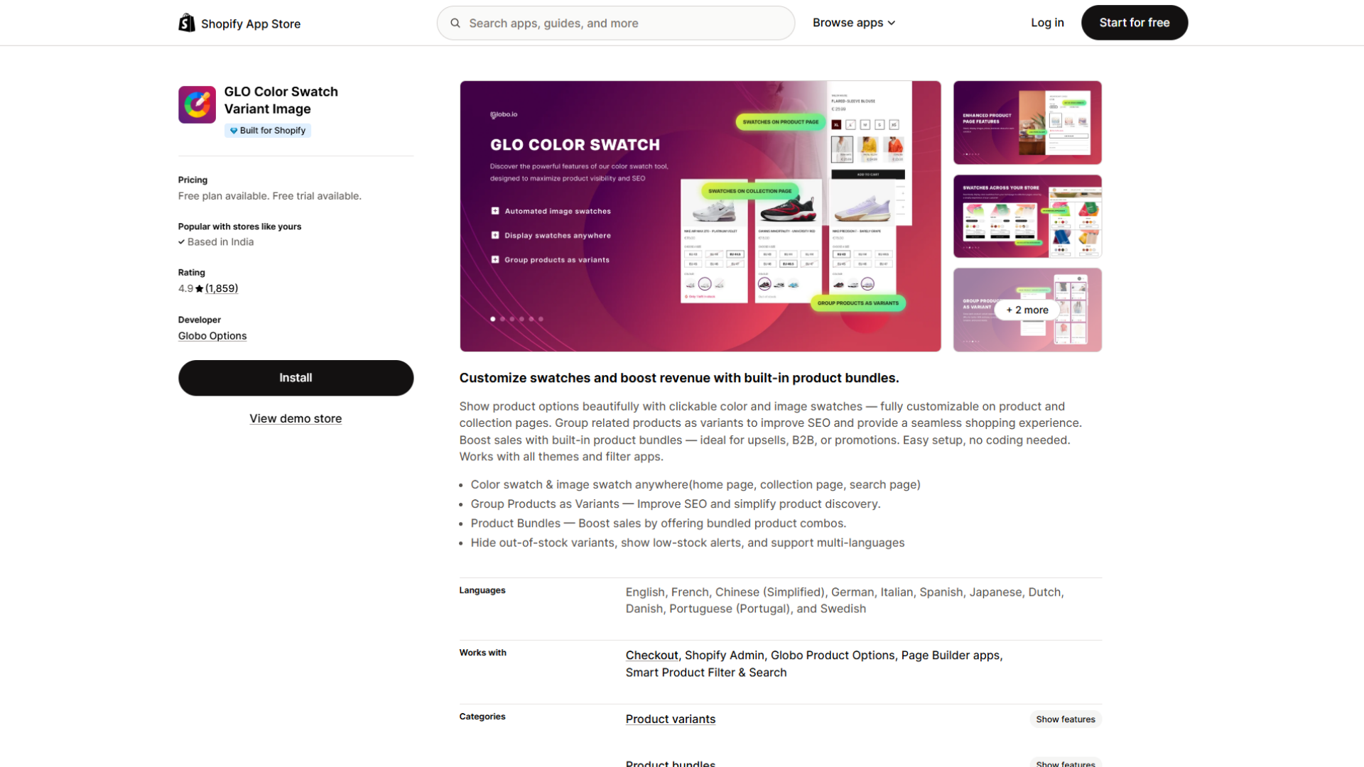
GLO Color Swatch is a swatch-focused app from the same developer, rated 4.9 across roughly 1,859 reviews, with a Built for Shopify badge. It provides clickable color and image swatches on product, collection, and home pages, product grouping, and built-in bundles.
Mobile swatch experience: Customizable color and image swatches across product and collection pages, working with themes and filter apps. Collection-page swatches are the mobile-relevant strength, as with Color Swatch King. Note that image swatches sit on the paid Silver tier, while the free plan covers color swatches only.
Tap and spacing: Supports custom CSS, so sizing and spacing can be tuned for comfortable mobile tapping. Configure rather than assume.
Variant types: Color and image swatches, dropdowns, radio buttons, with product grouping and bundle add-ons.
Performance: Built for Shopify badge present. No specific measurements claimed.
Pricing: Free plan (color swatches, collection-page variants, 1 product group). Silver $9.90/month (image swatches, variant image preview, extra display styles). Gold $19.90/month (unlimited product groups and bundles). 7-day free trial on paid tiers.
Best for: Merchants who want swatches plus bundling and quantity discounts in one app.
Limitations: Image swatches require a paid tier, and the bundling focus adds features you may not need if you only want swatches.
Verdict: A solid swatch-plus-merchandising option, especially where bundles and swatches are both on the roadmap.
Op Color Swatch Variant Images (Optis)
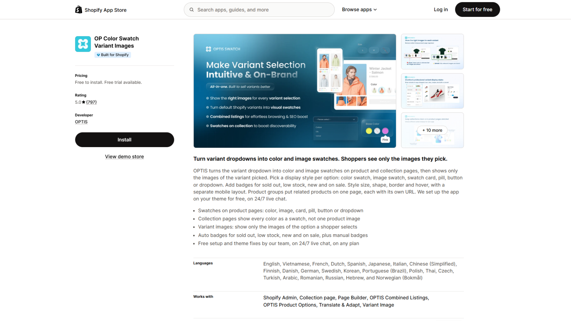
OP Color Swatch is a swatch-native app with a 5.0 rating across a growing review base, focused squarely on color and image swatches and variant images rather than a wider options builder.
Mobile swatch experience: Color and image swatches on product and collection pages, with variant images tied to selection. Merchant reviews specifically note it handles products with many variants, the harder mobile case.
Tap and spacing: Visual settings are adjustable. As always, verify sizing on a real phone.
Variant types: Color, image, and button-style swatches, plus variant images.
Performance: No specific measurements claimed.
Pricing: Shopify-plan-based, starting around $11.90/month on Basic and scaling to higher tiers on Grow, Advanced, and Plus. Free for development and trial stores, with a 30-day free trial.
Best for: Merchants who want a swatch-native app with strong high-variant handling and collection-page swatches.
Limitations: Plan-based pricing rises on larger Shopify plans, same pattern as Color Swatch King.
Verdict: A credible swatch-focused alternative, particularly for catalogs with dense variant sets.
Ns Color Swatch Variant Images (Nestscale)
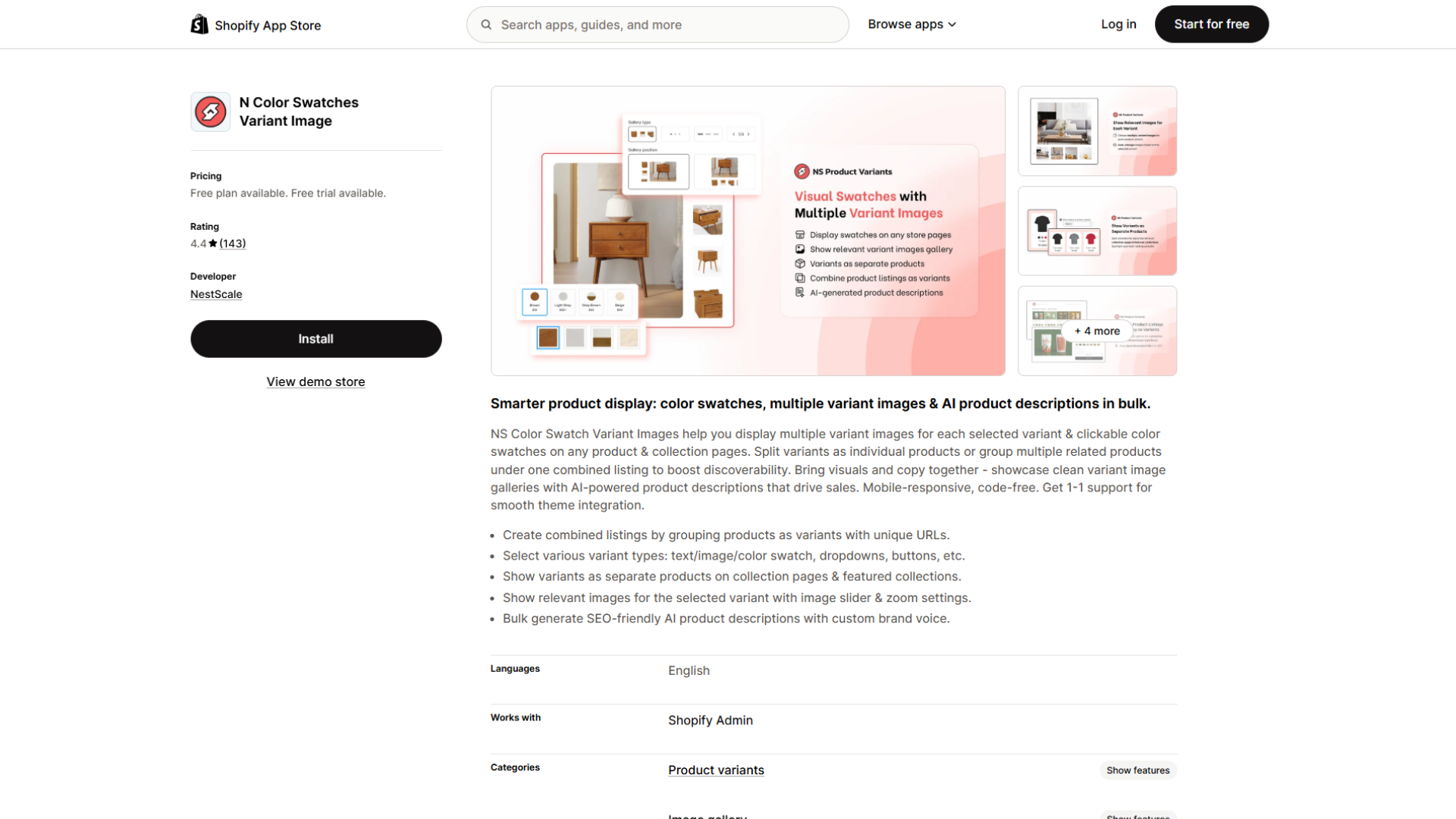
A swatch and variant-image app rated around 4.6, focused on swatch display, image swatches, variant image galleries, and grouping separate products as variants. It does not carry the Built for Shopify badge.
Mobile swatch experience: Color, image, dropdown, and button swatches, with collection-page swatches on product cards. This covers most mobile needs, though the tier split matters: image swatches and collection-page swatches sit on the paid Growth plan rather than the free one.
Tap and spacing: Swatch size, shape, layout, and styling are customizable, useful for setting comfortable mobile targets.
Variant types: Color, text, image, dropdown, and button swatches.
Performance: Not Built for Shopify certified, so lean harder on your own testing. No specific measurements claimed.
Pricing: Free plan (color and text swatches, product page only), Growth $7.99/month (image swatches, collection-page swatches, AI descriptions), Professional $14.99/month (combined listings, variant image gallery). Some add-on features cost extra.
Best for: Budget-conscious stores that still need collection-page and image swatches, provided they are on the Growth tier.
Limitations: The features most merchants want are on paid tiers rather than the free plan, no Built for Shopify badge, and some reviews mention UI and support friction.
Verdict: The cheapest genuine entry point for image and collection-page swatches, worth shortlisting on price with testing to confirm mobile polish.
A Closer Look At Starapps For Mobile
Feature lists are easy to skim past, so it helps to translate what Color Swatch King offers into what it means for a shopper holding a phone.
Swatches instead of dropdowns: The default Shopify dropdown forces a tap to open, a scroll to find the option, and a tap to select. Visible tappable swatches remove steps and keep every option on screen. On mobile, where each extra interaction risks losing the shopper, this is a direct usability gain.
Customizable size and spacing: Read "customizable" as control over the two things that most affect mobile tap success: how big each swatch is and how far apart they sit. This is what lets a merchant reach the 44px comfortable target and add spacing so thumbs do not mis-tap. The app gives you the levers; using them well is your job.
Color and image swatches: For products where color is the variant, a color swatch communicates instantly. For patterned fabric or textured finishes a flat color cannot capture, a variant image swatch shows the real thing. Having both means the swatch can match the product instead of forcing every product into one style.
Collection-page swatches: Letting shoppers switch variants from the collection page means fewer product-page visits and less pinch-and-scroll navigation on a phone. This is one of the more meaningful mobile benefits, because it makes the decision earlier.
Hiding or greying out unavailable variants: On a small screen, an out-of-stock option that looks identical to an available one wastes taps. Distinguishing or hiding unavailable combinations keeps mobile selection honest, and the app can also prevent default auto-selection, reducing accidental wrong-variant orders.
Theme compatibility and custom CSS: Because layout can be tuned per theme and adjusted with CSS, the grid can reflow cleanly at phone widths rather than overflowing a fixed desktop layout.
None of this makes Color Swatch King automatically the right app for every store. What it does is give a merchant the specific controls that mobile swatch usability depends on, which is more useful to know than a superlative.
Why Swatch Tap Size Matters On Mobile
On desktop, a mouse cursor is a single pixel. On mobile, the pointer is an opaque fingertip roughly 8 to 10mm wide, so shoppers cannot see exactly what they are about to hit. This is why touch targets have to be generous.
The guidance lines up clearly. WCAG sets 24 by 24 CSS pixels as the Level AA floor, recommends 44 by 44 at Level AAA, and both Apple (44pt) and Google (48dp) align near the higher figure. The honest one-sentence version: 24px is the floor you must not go under, and 44 to 48px is the size you should build.
Small controls cause three problems on mobile:
- Shoppers mis-tap and select the wrong variant.
- Adjacent swatches without spacing trigger accidental taps.
- Users with tremors or limited dexterity may be unable to select reliably, which is both an accessibility failure and a lost sale.
Spacing is part of the fix. WCAG allows smaller targets when they have sufficient clear space, so if you cannot make swatches larger, make sure they are not crowded.
Two related points belong here.
- Selected-state visibility: a shopper needs to see which variant is active without squinting, and a thin pale border often disappears on a phone in bright light, so use a clear high-contrast indicator.
- Non-color cues: color-blind shoppers cannot rely on the swatch color alone, so pair color with a visible label or a checkmark on the selected state.
How Swatch Layout Affects Mobile Shopping
Layout is where good swatches quietly go wrong on small screens.
- Too many swatches in one row forces either shrinking, which breaks tap size, or overflow, which breaks layout. Plan for wrapping.
- Awkward wrapping leaves orphaned single swatches or uneven grids that read as broken rather than intentional.
- Horizontal scrolling is the most damaging pattern, because shoppers do not expect to swipe sideways for color options and frequently miss anything off-screen.
- Long variant names like "Midnight Brushed Steel" can overflow, wrap mid-word, or push the grid out of alignment. Test with your longest label, not a short placeholder.
- Mixed image and color swatches in one group look cluttered if sizing is not harmonized.
- Poorly selected states leave shoppers unsure what they picked, worse on mobile where the full option set may not be visible at once.
- Swatches pushed below the fold by a tall image gallery mean shoppers may not realize variants exist. Watch how much vertical space sits above the swatches on a phone.
- Excessive vertical space between rows pushes the add-to-cart button further down.
Practical actions: cap comfortable swatches per row at phone width and let the rest wrap into a clean grid, keep labels short or truncate gracefully, harmonize image and color swatch sizes, and keep the swatch block reasonably high on the mobile product page.
Do Shopify Swatch Apps Slow Down Stores?
Not automatically. A swatch app's performance impact depends on how it is implemented, how much JavaScript and CSS it loads, how it handles swatch images, whether it makes third-party requests, your theme's architecture, your product and variant count, and what other apps you already run. Two stores can install the same app and see different results because their themes and app stacks differ.
Shopify's Built for Shopify badge, which Color Swatch King, Globo, and GLO carry, is a useful signal because it indicates the app has met Shopify's performance standards. It is a genuine third-party check, but still not a measurement of your store.
The only reliable way to know an app's impact is to measure it directly, which the next section covers. Avoid concluding generic "app X slows sites" claims, because they rarely account for the specific combination that produces your result.
How To Test A Shopify Swatch App On Mobile
Here is a practical checklist for generating performance and usability data that reflects your store.
- Test different screen sizes: Check small phones, larger phones, and both portrait and landscape where relevant. A layout that works at 400px may break at 360px. Browser dev tools simulate widths, but confirm on at least one real device, because emulators do not replicate touch precisely.
- Test different products: Use a product with few variants, one with many variants, one with long variant names, one with image-based variants, and one with unavailable options. Each surfaces a different failure mode: wrapping, tap size, label overflow, image-swatch clarity, and unavailable-state visibility.
- Test interaction: On a real phone, check tap accuracy (does the right variant select on the first try), selected-state clarity, switching between variants, image changes, price updates, and availability changes. This is the part emulators cannot do well.
- Test performance: Compare the storefront before and after installing the app under consistent conditions. Run Shopify's own speed tools, or PageSpeed Insights, on the same product URL, same network, same device profile, ideally at the same time of day. Consistency is what makes the comparison meaningful: if you change the product, connection, or device between measurements, the difference may come from those changes rather than the app. Run each test a few times and read the pattern, not a single number.
Testing your own store this way gives you data you can trust, which is worth more than any generic benchmark, including anything in this guide.
Common Mobile Swatch Mistakes
- Swatches too small to tap reliably. Stay above the 24px floor, and aim for 44 to 48px.
- Insufficient spacing between swatches, causing accidental taps.
- Unclear selected states that leave shoppers guessing.
- Poor contrast that makes swatches or their borders hard to see on a bright screen.
- Relying on color alone, which fails color-blind shoppers. Pair color with a label or checkmark.
- Too many options with no organization, turning the selector into a wall.
- Horizontal scrolling that hides options shoppers never discover.
- Long labels that break the layout because they were only tested with short names.
- Missing unavailable-state indicators, so shoppers tap out-of-stock options.
- Swatches that do not match product imagery, creating doubt about the selection.
- Ignoring smaller screens by only checking the layout on a laptop.
- Installing multiple overlapping variant apps, which can conflict, duplicate selectors, and add avoidable page weight.
Which Shopify Swatch App Should You Choose?
There is no single winner, because the right app depends on what your store needs. Organize the decision around requirements.
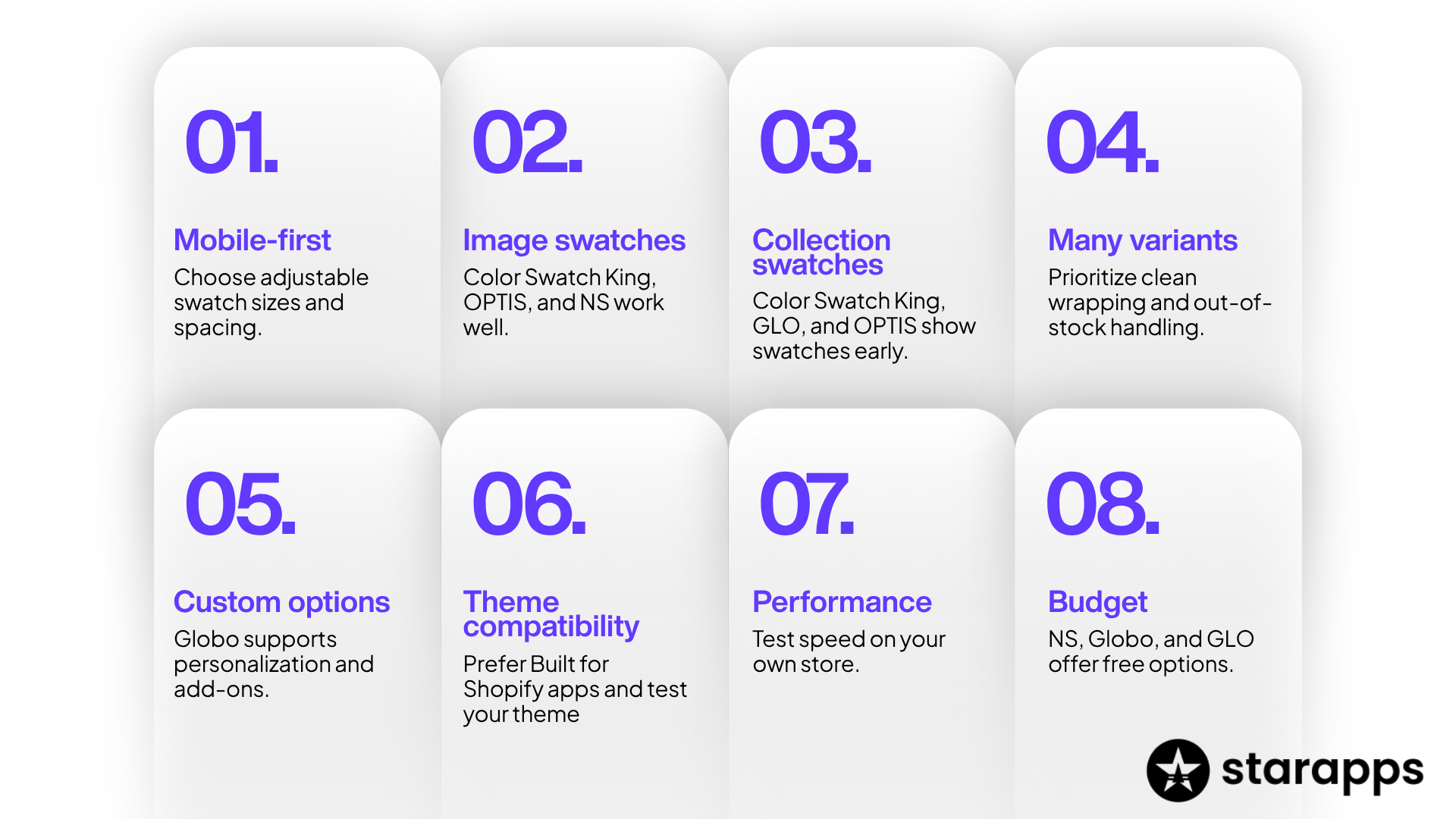
- Mobile-first swatch UX is the priority: choose a swatch-focused app with adjustable sizing and spacing so you can hit comfortable tap targets. Color Swatch King and OPTIS fit here.
- You need image swatches for textured or patterned products: prioritize strong image-swatch handling. Color Swatch King, OPTIS, and NS Color Swatch apply.
- Collection-page swatches matter: Color Swatch King, GLO Color Swatch, and OPTIS surface swatches before the product page, reducing mobile navigation. On NS, this sits on a paid tier.
- You have large variant catalogs: prioritize clean wrapping and out-of-stock handling, and test heavily with your highest-variant product. OPTIS reviews specifically cite this case.
- You need custom options beyond variants (personalization, add-ons, conditional logic): Globo Product Options is the more complete fit, with swatches as one capability among many.
- Theme compatibility is a concern: favor Built for Shopify apps and confirm behavior on your specific theme.
- Performance is the top priority: shortlist Built for Shopify apps, then measure on your own store rather than trusting any ranking.
- Budget is tight: NS Color Swatch has the lowest entry price for image and collection-page swatches, and Globo and GLO offer genuine free tiers. Compare what each free plan actually includes.
Match the app to the row that describes your store, then validate with the testing checklist. That process serves you better than any ranking, and it works for apps not covered here.
Frequently Asked Questions
What is a mobile-friendly Shopify swatch app?
A swatch app whose variant options tap comfortably, space cleanly, wrap sensibly, and load efficiently on phone screens, not one with the longest feature list. The measure is how well shoppers can select variants with a thumb on a small screen.
What makes Shopify swatches mobile-friendly?
Adequate tap size (24px floor, 44 to 48px comfortable), clear spacing between options, a high-contrast selected state, clean wrapping with no horizontal scrolling, and legible labels that hold up on a narrow screen.
Do Shopify swatch apps affect page speed?
They can, but not automatically. Impact depends on the app's implementation, image handling, third-party requests, your theme, variant count, and other apps. Built for Shopify apps have met Shopify's performance bar, but measure impact on your own store to be certain.
What size should Shopify swatches be on mobile?
WCAG 2.2 sets a minimum of 24x24 CSS pixels, or smaller with adequate spacing. For comfortable tapping, aim for 44 to 48px, matching Apple's 44pt and Google's 48dp. Never go under 24px, and build primary controls at 44 to 48px.
Are image swatches better than color swatches on mobile?
Neither is universally better. Color swatches communicate a flat color instantly and stay clear at small sizes. Image swatches are better for patterns, textures, or finishes a flat color cannot represent, but they must stay large enough to interpret on a phone.
How do I make Shopify variant selection easier on mobile?
Increase swatch size toward 44 to 48px, add spacing so adjacent targets do not overlap, use a clear high-contrast selected state, avoid cramming too many swatches into one row, and pair color with a label for color-blind shoppers. Apps with customizable sizing let you set these directly.
Can Shopify swatches work with any theme?
Most current swatch apps aim for broad theme compatibility, and Built for Shopify apps are held to integration standards. Compatibility is rarely universal in practice, so test on your specific theme, especially wrapping and selected-state behavior, before launch.
How do I test Shopify swatches on mobile?
Use a real phone, not just an emulator. Test products with few and many variants, long labels, image variants, and out-of-stock options. Check tap accuracy, selected state, wrapping, and horizontal scrolling. For performance, compare before and after under consistent conditions using PageSpeed Insights or Shopify's speed tools.
Heading

End-to-end traceability
To ensure regulatory compliance, you must have a complete overview of your products from production to shipping. Book a demo to see how Katana can give you full visibility of your operations.
.png)

.svg)

.svg)

.svg)
.png)